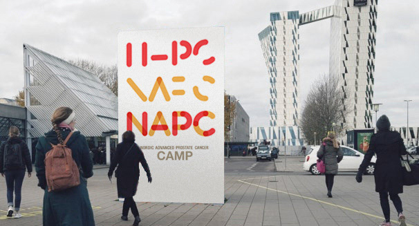
NAPC
Nordic Advanced Prostate Cancer
Client: Astellas Pharma
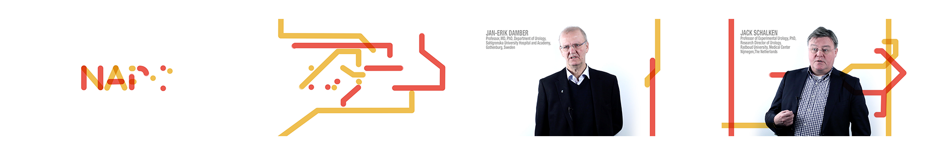
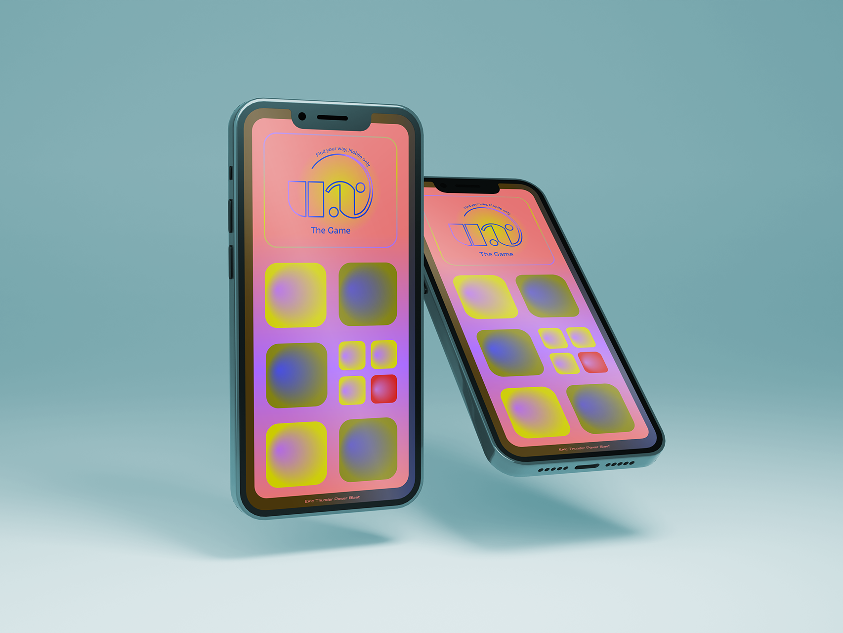
Conference brand identity for a medical prostate cancer academy. Bringing two camps together in order to support the patient centric-approach and the idea of the Multi Disciplinary Team. Oncologists (yellow) and Urologists (red).
The design is a modular approach which makes us able to build and construct different shapes and forms. It makes is possible for us communicate Patient Journey, the combination of the two existing camps and the general understanding of the MDT-approach.
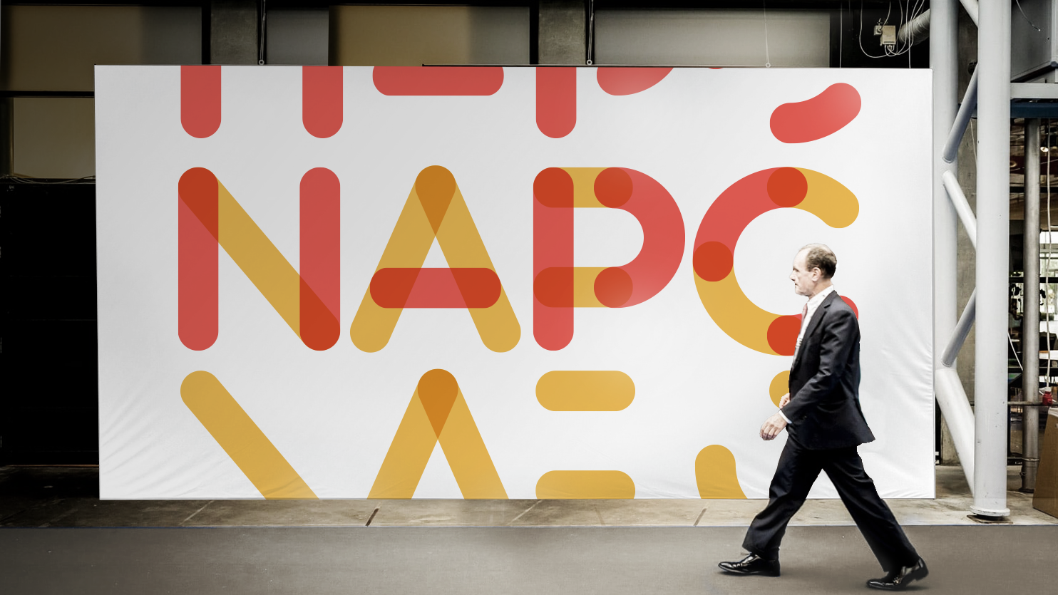
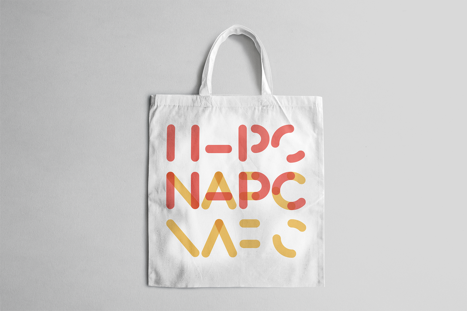
The elements are used accross all the different materials; film, banners, conference, PPT’s, handouts, the website etc.
Part of the briefing was to keep the red and yellow color. because they where already established within the brand universe
Two camps merge to one
Urologists + Oncologists


Urologists (red)

Oncologists (yellow)

Urologists (red) + Oncologists (yellow)

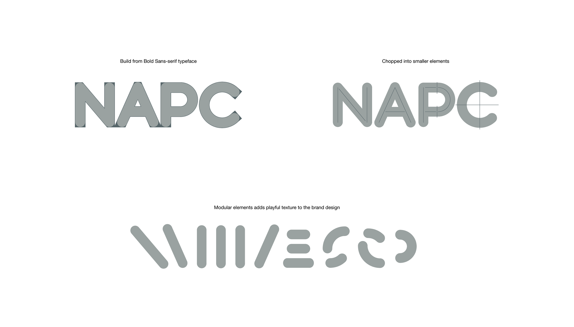
The modular design is not only use as brand design but also as a playful texture In various compositions

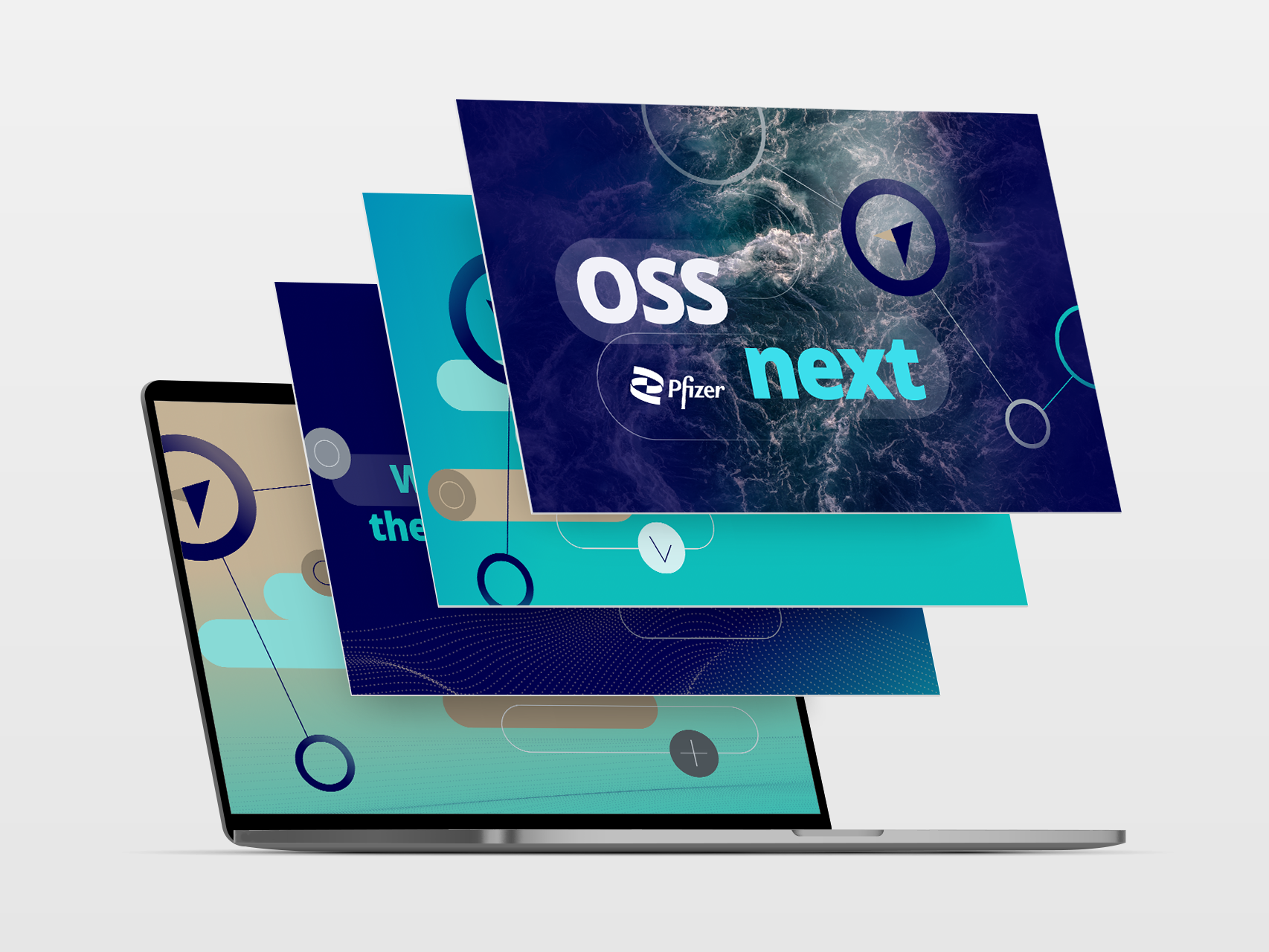
Animated graphic for big screens introduction and key speakers. The animation below is running in dobbelt speed of the final film

Explainer film for what to expect and summary of how to move forward